ShopDreamUp AI ArtDreamUp
Deviation Actions


Description
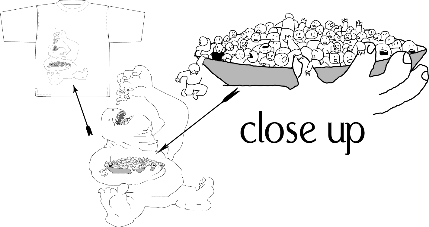
Glutton-the image loses a little when reduced. If you download it you should be able to zoom in close.
© 2005 - 2024 michaelpatrick
Comments6
Join the community to add your comment. Already a deviant? Log In
Thanks for the comments.
The jagged lines were kind of intentional. So many of my drawings are vector and they look so clean that they are lifeless. I thought I'd try something different. Color is a good idea, but I don't know if I have the physical and or mental energy (or the time) to get into that now. As for ripping, that's hardly a concern for me (so far anyway).
If I get the time, I'll try and squeak out another go at this one (Smile)")
The jagged lines were kind of intentional. So many of my drawings are vector and they look so clean that they are lifeless. I thought I'd try something different. Color is a good idea, but I don't know if I have the physical and or mental energy (or the time) to get into that now. As for ripping, that's hardly a concern for me (so far anyway).
If I get the time, I'll try and squeak out another go at this one